
Arno Surfboards
Arno is a creative collaboration between twin brothers Jacob and Oscar Arnold, born out of a shared desire to work together and combine passions. Established in 2020, Arno Surfboards is Jacob’s Gower-based business, dedicated to crafting hand-shaped surfboards that blend experimental craftsmanship with creative expression. Meanwhile, Studio Arno is Oscar’s creative design venture, where art and visual storytelling take centre stage.
Together, through Arno, they’ve created an opportunity to collaborate as brothers, representing and supporting those who want to experience and explore their culture and interests through art. Whether it’s designing surfboards, producing artwork or organising events, Arno is about bringing people together to celebrate creativity and community.
To discuss carrying out commissioned work or to acquire wholesale prices, please email: arnosurfboards@gmail.com
You may also reach me using the link below:
Instagram - @arnosurfboards
Logo Design
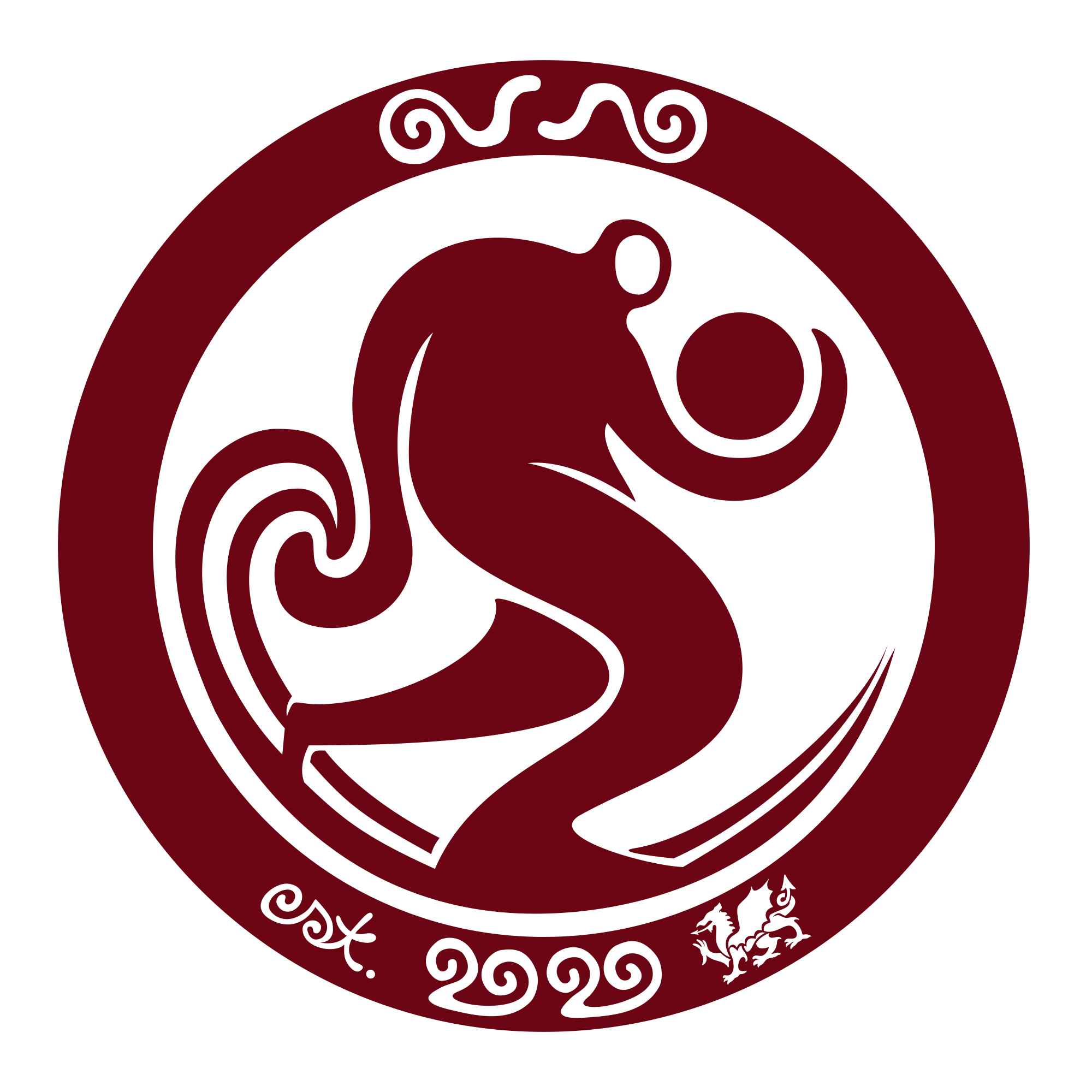
The Arno logo was born from a need to represent both my work as an artist and my twin brother’s surfboards. Since our last name is Arnold, it provided a natural starting point for our brand identity.
As we explored different ideas, we came across the Welsh word ‘Arnonofio,’ which means “to float.” It felt like a perfect match for our surf-inspired brand, but we wanted something simpler and more memorable. That led us to ‘Arno,’ a word that’s not only shorter but also has roots in the Welsh language, meaning to be ‘on’ something in a functional way - a concept that aligns with both our creative practices.
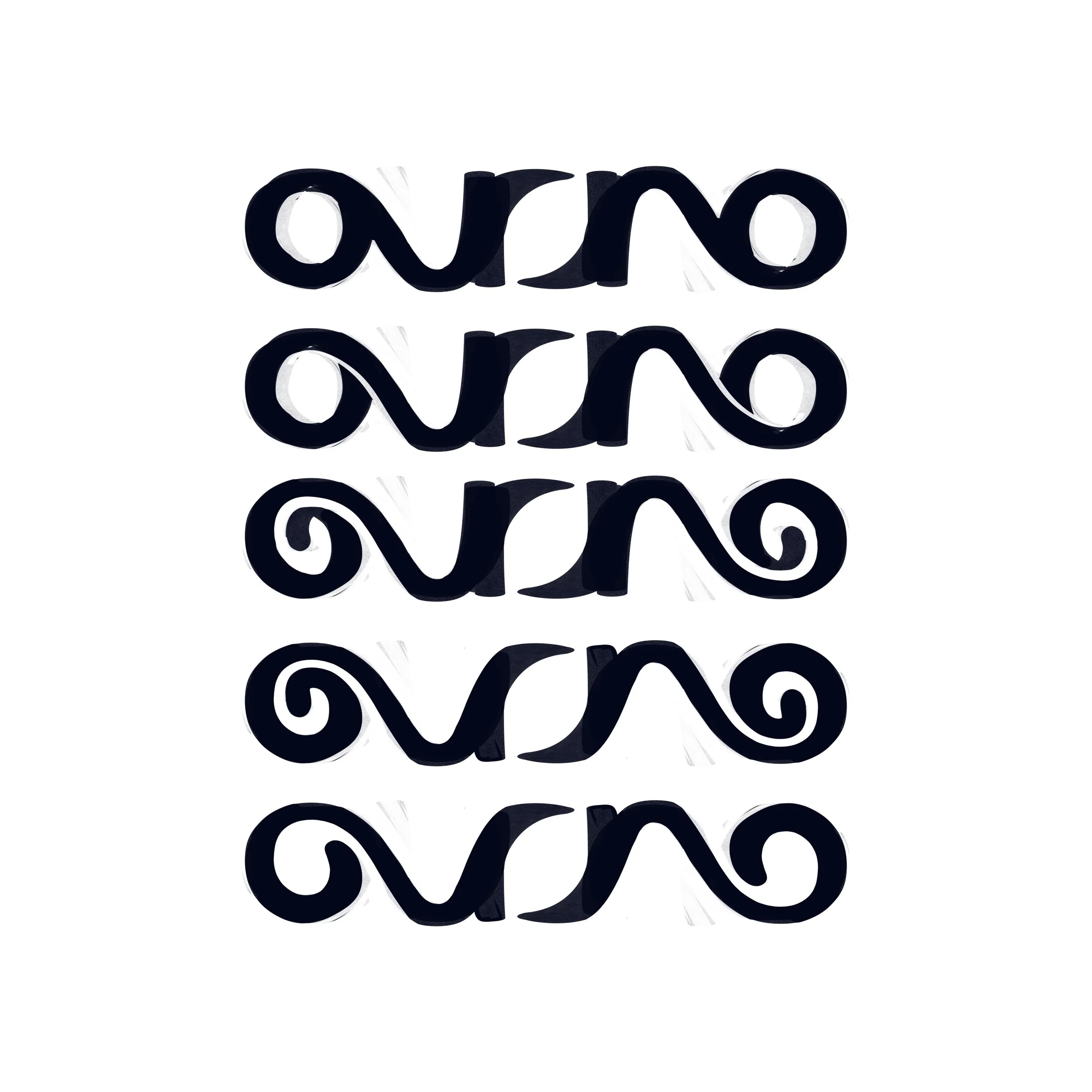
When it came to designing the logo, I created an ambigram, a design that can be read upside down. This unique feature ensures that the logo remains visible and correctly oriented, which ever way the surfboard is under your arm. For us, it’s more than just a visual element; it’s a reflection of our philosophy: to be functionally ‘on’ this world, embodying both art and craftsmanship in everything we do.
Earlier Development
